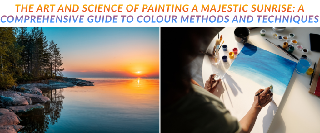
The sunrise represents one of the most dynamic, transient, and visually complex events in the natural world. For centuries, capturing the fleeting luminosity of dawn has been a primary pursuit for landscape painters, pushing the boundaries of medium, pigment chemistry, and observational science. The challenge lies not merely in replicating a sequence of colours, but in simulating the intricate physics of atmospheric light on a two-dimensional surface. To paint a majestic sunrise requires a synthesis of atmospheric optics, perceptual colour theory, historical pigment knowledge, and absolute mastery over specific artistic mediums.
This comprehensive report explores the multi-disciplinary approach required to render a convincing and emotive sunrise. By examining the optical physics that govern dawn, the historical development of the artist’s palette, and the specific material techniques of oil, acrylic, watercolour, and digital painting, a complete methodology for capturing atmospheric light emerges.
The Physics of Dawn: Light, Atmosphere, and Optics
Before an artist can mix paint or select digital blend modes, a foundational understanding of atmospheric optics is required. The colours observed during a sunrise are not intrinsic to the sky itself but are the result of solar radiation interacting with the Earth’s atmosphere.
Solar Irradiance and the Electromagnetic Spectrum
The sun emits a broad spectrum of electromagnetic radiation. The sunlight reaching the Earth’s surface is composed of approximately 49.4 per cent infrared radiation (which we feel as heat), 8 per cent ultraviolet radiation (UVA and UVB), and 42.3 per cent visible light1. The visible spectrum spans wavelengths from approximately 380 nanometers (violet) to 700 nanometers (red)1.
While the Sun’s spectral irradiance peaks near 500 nanometers (in the blue-green range), it simultaneously emits massive amounts of red, yellow, and orange photons2. When these wavelengths are combined in the vacuum of space, the Sun produces pure white light2. Instruments measuring the star’s effective colour temperature at around 5,800 Kelvin confirm this white output2. The perception of a yellow, orange, or red sun is entirely an optical illusion crafted by the Earth’s atmosphere2.
Rayleigh Scattering
The primary mechanism responsible for the colour of the sky is Rayleigh scattering, named after the nineteenth-century British physicist Lord Rayleigh, John William Strutt, who established the mathematical model for the phenomenon in the late 1800s3. As solar radiation enters the Earth’s atmosphere, it collides with nitrogen (78 per cent of the atmosphere) and oxygen (21 per cent) molecules4. Because these molecules are significantly smaller than the wavelengths of visible light, they scatter the light inversely proportional to the fourth power of the wavelength3.
Consequently, shorter wavelengths are scattered far more efficiently than longer ones. Blue light (around 400 nanometers) is scattered roughly 9.4 times more efficiently than red light (around 700 nanometers)4. During the day, this scattered blue light bounces across the atmosphere, resulting in the characteristic blue sky5. While violet light is actually scattered even more than blue, the human eye is significantly more sensitive to blue light, and a portion of violet light is absorbed by the upper atmosphere4.
At sunrise, however, the sun is positioned at or below the horizon. Sunlight must travel through a vastly thicker, denser slice of the Earth’s atmosphere to reach the observer2. By the time the direct beams reach the eye, nearly all of the short blue and violet wavelengths have been scattered away into space2. Only the longest wavelengths—deep reds, oranges, and yellows—survive this journey, passing straight through the atmosphere to paint the horizon in warm, fiery hues2.
Ozone Absorption and the Zenith
An often-overlooked factor in the colour of the twilight sky is ozone absorption. In 1953, researcher Edward Hulburt demonstrated that Rayleigh scattering alone cannot fully account for the deep blue colour of the sky directly overhead (the zenith) during sunset and sunrise8. Hulburt discovered that the Chappuis absorption bands of ozone are responsible for absorbing a significant portion of the yellow and orange light that passes through the upper atmosphere8.
During a sunrise, Rayleigh scattering accounts for roughly one-third of the blue colour at the zenith, while ozone absorption accounts for the remaining two-thirds8. For the artist, this dictates that the transition from a warm, orange horizon to a deep blue zenith is not merely a gradient of scattered light, but a complex interaction of gas absorption that keeps the overhead sky distinctly, intensely blue rather than an opaque, murky gray9.
Mie Scattering and Cloud Illumination
While Rayleigh scattering affects atmospheric gases, Mie scattering occurs when light interacts with larger particles, such as water droplets, ice crystals, aerosols, dust, and pollution7. Unlike Rayleigh scattering, Mie scattering is not strongly dependent on wavelength; it tends to scatter all colours of light equally11.
This phenomenon explains why clouds, fog, and heavy haze generally appear white or gray11. However, during a sunrise, these clouds act as a projection screen for the Rayleigh-filtered light. As the sun rests below the horizon, its reddened rays illuminate the undersides of mid- and high-level clouds (such as altocumulus and cirrus clouds), transforming them into brilliant strokes of magenta, red, and gold13. Low-level clouds (stratus or stratocumulus), often obscured by the thickest parts of the atmosphere and local dust, usually appear darker or less vividly colored, catching the light only as the sun rises higher13.
Atmospheric Phenomena: The Belt of Venus and Crepuscular Rays
Two specific optical phenomena are highly prized in sunrise compositions for their ability to add depth and atmospheric realism: the Belt of Venus and Crepuscular rays.
The Belt of Venus, or the anti-twilight arch, is a delicate pink or lilac band visible on the horizon directly opposite the rising sun14. As the reddened sunlight traverses the atmosphere, it backscatters off the dense air and particulates in the west, creating this soft pink glow15. Immediately beneath this pink band lies a dark, grey-blue horizontal strip. This is the Earth’s Shadow, the physical shadow of the planet cast into its own unlit atmosphere14. The transition from the dark purple shadow to the pink Belt of Venus to the blue sky above provides a magnificent, harmonious colour gradient for landscape artists14.
Crepuscular rays, commonly known as sunbeams, are visible shafts of light that appear to radiate outward from the sun through gaps in clouds or mountainous horizons16. While these rays appear to diverge outward in a fan shape, this is an optical illusion created by linear perspective16. The rays are actually parallel columns of sunlight rendered visible by Mie scattering off atmospheric dust, smoke, and water vapour in the air16. Accurately depicting the geometric convergence of these rays toward a single vanishing point (the sun) is essential for creating deep, three-dimensional space in a sunrise painting16.
Perceptual Colour Theory and Atmospheric Perspective
Translating the physics of dawn into a painting requires a rigorous application of colour theory. The artist must manage the relationships between light, shadow, colour temperature, and luminance to create a convincing illusion.
The Warm Light and Cool Shadow Principle
In natural outdoor lighting (plein air), colour temperature operates on a dynamic relationship between direct illumination and ambient reflection20. During a sunrise, the direct light from the sun is exceptionally warm, leaning heavily into yellows, oranges, and reds20. Conversely, the shadows cast by objects in the landscape are not entirely devoid of light; they are illuminated by the ambient, indirect light of the expansive blue sky above20.
Because the ambient sky light is cooler (measuring around 7000 Kelvin) than the direct sunlight (which sits closer to 5000 Kelvin or lower at dawn), a fundamental rule of landscape painting emerges: warm light yields cool shadows22. If a sunrise illuminates a field, the sunlit grasses will appear warm and golden, while the cast shadows stretching away from the light will inherit a blue or violet tint from the sky’s reflection20. This complementary contrast causes the lit areas to appear substantially brighter and more luminous than they would if the shadows were simply painted with a darker value of the local color20.
Chevreul’s Simultaneous Contrast and Impressionist Luminance
The Impressionists revolutionised the depiction of sunrise by manipulating luminance—the perceived brightness of a colour independent of its hue—and applying the theories of chemist Michel Eugène Chevreul regarding simultaneous contrast24. Chevreul observed that colours intensify each other when placed next to their complements; a yellow will glow brighter when placed next to purple, and an orange will vibrate against a blue24.
Claude Monet’s seminal 1872 painting, Impression, Sunrise, which gave the Impressionist movement its name (originally coined as a pejorative by art critic Louis Leroy), relies heavily on this manipulation26. In the painting, the brilliant orange sun appears to pulsate against the cool blue-grey fog of the Le Havre harbor26. Neurobiological studies of the painting reveal a fascinating optical trick: the orange sun and the surrounding grey-blue sky have the exact same luminance value26. If the painting is viewed in grayscale, the sun virtually disappears into the sky26. Because the human brain processes colour and luminance in different visual pathways, placing an isoluminant, highly saturated warm colour against a complementary cool background creates an optical vibration24. The sun appears to glow and shimmer, mimicking the blinding effect of real sunlight25.
Da Vinci’s Sfumato and Atmospheric Perspective
Atmospheric perspective, also known as aerial perspective, dictates how objects alter in appearance as they recede into the distance. Leonardo da Vinci was the first to systematically document this phenomenon in his notebooks, observing that the volume of air between the viewer and a distant object shifts the object’s colour toward blue while reducing its tonal contrast and edge sharpness29. Da Vinci noted, “the remotest objects, such as mountains, appear blue and almost of the same hue as the atmosphere itself”29.
Da Vinci’s formalisation of this concept—which he called the “perspective of disappearance”—birthed the technique of sfumato (meaning “smoked” or “blurred”)29. Sfumato involves softening transitions between colours and eliminating harsh outlines, mimicking how light scatters around distant objects31. In a sunrise painting, atmospheric perspective is critical. Foreground elements feature the highest contrast, the darkest darks, and the warmest colors33. As the landscape recedes toward the rising sun, the terrain loses its local colour, the dark shadows lighten, and the entire landmass takes on the ambient colours of the dawn mist—often dissolving into soft purples, pale blues, or hazy oranges33.
The Pitfalls of Photographic Reference
Landscape painters, particularly those working en plein air (outdoors), frequently note the limitations of photographic reference when capturing a sunrise. Cameras, lacking the dynamic range of the human eye, struggle to balance the extreme contrast between the bright sky and the dark ground35. If a camera exposes for the sky, the ground becomes a black silhouette, losing all ambient color36. If it exposes for the ground, the sky “blows out” to stark white, destroying the delicate colour gradients of the dawn36.
Artists must compensate by actively observing the colour temperature shifts that a camera flattens. Shadows on the ground are not black; they contain reflected sky blue22. High Dynamic Range (HDR) photography can aid in this, but the artist’s perceptual understanding of colour relativity remains the most vital tool36.
Pigment History, Chemistry, and Selection
The ability to accurately render a sunrise is intrinsically linked to the historical availability of pigments. For centuries, artists struggled to capture the sky due to a lack of stable, affordable blues and vibrant, lightfast yellows.
The Evolution of the Blue Sky
The sky is the dominant element in a sunrise painting, requiring blues that can capture both the deep, cool zenith and the warm, atmospheric horizon. Throughout history, the quest for a stable blue pigment has driven chemical innovation.
| Pigment Name | Historical Origin | Chemical Composition & Characteristics | Application in Sunrise Painting |
| Ultramarine Blue | Antiquity / Synthetic in 1826 | Originally derived from semi-precious lapis lazuli; synthetic version (PB29) created by Jean-Baptiste Guimet. A warm, reddish-blue37. | Ideal for the deep, high-altitude zenith of the sky. Granulates beautifully in watercolour, creating atmospheric texture37. |
| Prussian Blue | 1706 (Berlin, Germany) | Created accidentally by Johann Jacob Diesbach using potash and ox blood (PB27)37. Intense, dark, and highly tinting. | Useful for the darkest, coolest parts of the night sky fading into dawn. Possesses a slight green undertone37. |
| Cobalt Blue | 1799 (France) | Invented by Louis Jacques Thénard (PB28), a cobalt aluminate41. | The quintessential “sky blue” of the 19th century, favoured by Turner and Monet. Milky, semi-opaque, and highly lightfast38. |
| Cerulean Blue | 1789 / 1860s | Initially invented by Albrecht Höpfner (PB35) using cobalt stannate38. | A heavy, opaque, and cool blue. Excellent for the lower atmosphere just above the warm horizon glow, where the sky lightens38. |
| Phthalocyanine Blue | 1935 | A synthetic organic pigment based on copper phthalocyanine (PB15)38. | Extremely intense and highly staining. Used sparingly for vibrant, modern sky gradients, though it can easily overpower a mix38. |
The invention of synthetic Prussian Blue in the early 18th century, followed by Cobalt and synthetic Ultramarine in the 19th century, liberated painters to capture the sky accurately and affordably without relying on the prohibitively expensive lapis lazuli23.
The Warmth of Dawn: Yellows and Oranges
Capturing the fiery epicentre of the sunrise requires luminous yellows and oranges. Historically, artists relied on heavy earth tones (ochres) or highly toxic minerals (orpiment) to render yellow.
During the 18th and 19th centuries, artists like J.M.W. Turner utilised Indian Yellow, a highly transparent and luminous pigment famously (and controversially) derived from the urine of cows fed exclusively on mango leaves in Bengal, India44. Its incredible transparency made it perfect for glazing glowing atmospheric effects over skies, though its permanence was often questionable44.
Modern artists have access to far superior chemistry. Cadmium yellows (PY35, PY37) were introduced in the 19th century, replacing toxic chrome yellows47. Cadmiums provide unmatched opacity and tinting strength, making them ideal for the solid, blinding disk of the sun48. Conversely, Hansa Yellows (Arylide yellow, PY3, PY75), developed in Germany just prior to World War I, offer brilliant, semi-transparent alternatives48. Hansa yellows are cleaner in masstone and highly transparent, making them the modern equivalent to Indian Yellow for glazing glowing halos of light around the rising sun48.
ASTM Lightfastness and Permanence
When selecting pigments for a sunrise, the artist must prioritise permanence. The American Society for Testing and Materials (ASTM) classifies artist pigments on a lightfastness scale, where ASTM I indicates excellent lightfastness (withstanding years of exposure without visible colour change), and ASTM V indicates a fugitive pigment prone to rapid fading49.
Testing is rigorous. Pigment swatches (typically diluted 1 part paint to 4 parts water) are painted alongside a standardised “blue wool” reference card and exposed to natural sunlight or intense laboratory UV light49. If a pigment begins to fade before the reference card, it receives a lower rating49.
The atmospheric skies painted by J.M.W. Turner have, in many cases, lost their original majesty because he frequently employed fugitive yellow lakes, saffron derivatives, and unstable red pigments that faded into dull browns and greys over time46. Today, artists are advised to strictly utilise ASTM I and II rated pigments—such as pure Cadmiums, modern synthetic earth oxides, and Phthalocyanines—to ensure the sunrise retains its original brilliance for centuries48. Highly fugitive colours famous for their beauty, such as Alizarin Crimson (PR83) and Opera Pink, should be avoided in permanent works, replaced by stable alternatives like Quinacridone Rose (PV19)53.
Oil Painting: Depth through Underpainting, Glazing, and Impasto
Oil paint, with its slow drying time and capacity for extreme transparency and opacity, is arguably the most capable traditional medium for capturing a majestic sunrise. The process requires a methodical, layered approach.
The Underpainting and Toned Ground
A bright white canvas can visually interfere with the accurate judgment of colour values, often causing painters to misjudge their midtones. Therefore, oil painters typically begin with a toned ground or underpainting55. The choice of earth tone sets the temperature for the entire piece.
Burnt Sienna (a warm, red-brown) and Raw Umber (a cooler, greenish-brown) are standard choices56. For a sunrise painting, an underpainting of Burnt Sienna provides a warm, radiant undertone58. As subsequent layers of cool blue and grey are painted over the sky, micro-fissures in the brushwork allow the warm Burnt Sienna to peek through, harmonising the cool sky with the warm light of dawn56. Furthermore, establishing the darkest silhouettes of the foreground early in the underpainting stage (working from dark to light) sets the total tonal range, allowing the artist to push the highlights of the sun to their maximum relative brightness without losing contrast59.
Glazing and Scumbling
The illusion of atmospheric depth in oil painting relies heavily on the interplay between glazing and scumbling.
Glazing is an indirect painting technique that involves applying a thin, transparent layer of darker paint over a thoroughly dried, lighter under-layer60. The glaze is created by mixing a small amount of pigment (roughly 5 per cent) with a high ratio of oil medium (such as a traditional recipe of 2 parts damar varnish, 2 parts stand oil, and 10 parts turpentine)60. This technique acts like a sheet of colored glass, physically allowing light to pass through the pigment and reflect off the opaque layers beneath, resulting in a stained-glass luminosity that cannot be achieved by directly mixing opaque paints61. Glazing is highly effective for building the deep, receding shadows of clouds or the subtle colour shifts of the upper zenith60.
Scumbling is the structural opposite of glazing. It involves dragging a dry, sticky, opaque or semi-opaque lighter paint over a darker, dry under-layer62. Using a stiff bristle brush or a flat decorating brush, the paint catches only on the raised texture of the canvas weave, leaving a broken, textured film of color62. As J.M.W. Turner demonstrated, scumbling is the ultimate technique for rendering atmospheric haze, fog, and the hazy diffusion of light around the sun62. A classic sunrise technique involves scumbling a complementary warm orange over a dry, cool blue sky, creating a vibrating, optical mix that mimics the scattering of light through atmospheric dust62.
Impasto and Palette Knife Application
To maximise the impact of the sun and the highlights on the clouds, artists employ the impasto technique, applying paint so thickly that it stands off the canvas in three-dimensional relief64.
Using a palette knife, the artist mixes thick, opaque paint—often Titanium White mixed with Cadmium Yellow or Cadmium Orange—and applies it directly to the epicentre of the sunrise64. The physical ridges of the impasto catch the actual gallery light, casting microscopic shadows on the canvas and adding a physical, tactile brightness to the painted light64. Palette knives are also exceptional for blocking in the crisp, hard edges of silhouetted foreground elements (such as mountain ridges or distant trees), contrasting sharply against the soft, scumbled gradients of the background sky66.
Acrylic Painting: Managing Time and Media
Acrylic paint offers rapid layering and high durability, but its notoriously fast drying time poses a significant challenge when attempting to paint the seamless, sweeping gradients of a sunrise sky.
Overcoming Fast Drying Times with Retarders
To achieve the soft transitions required for a dawn sky, acrylic painters must modify the chemical behaviour of the paint. The addition of an acrylic fluid retarder or slow-dry medium is essential67. Retarders slow the evaporation of water from the acrylic polymer emulsion, extending the “open” working time of the paint by up to 50 per cent, allowing the artist to blend colours on the canvas without the paint pulling or turning chalky68.
Additionally, lightly misting the canvas and the palette with water from a fine-mist spray bottle keeps the paint workable68. However, the artist must be cautious not to over-saturate the surface. Excessive water will break down the acrylic polymer binder, causing the pigment to lift, pool unevenly, or lose its adhesive properties entirely68.
Transitional Mixing and Wet-on-Wet Blending
Attempting to blend two highly contrasting colours directly on the canvas often results in a streaky, overworked sky. The most effective method for acrylics is “transitional mixing”68.
Before touching the canvas, the artist pre-mixes a gradient of intermediate shades on a stay-wet palette (a palette with a damp sponge beneath a semi-permeable membrane)68. For example, if transitioning from a dark ultramarine zenith to a bright orange horizon, the artist will mix three or four intermediate steps combining the blue and orange, utilising a buffer colour like magenta to prevent muddiness. These transitional shades are then painted onto the canvas in horizontal bands68.
While the bands are still wet, a large, soft synthetic mop or filbert brush is used to gently sweep back and forth along the borders where the bands meet67. Using a light touch and pulling the brush horizontally creates a smooth, cinematic gradient without lifting the underlying layers67. Because acrylics dry quickly, transparent glazes (paint thinned with polymer gloss medium, not just water) can be applied over these gradients within minutes, adjusting the warmth and lightness of the clouds as they approach the sun70.
Alternative and Mixed Media Applications
The versatility of acrylics allows for non-traditional approaches to the sunrise. Fluid acrylic pouring, utilising pouring mediums like Floetrol, allows artists to manipulate liquid dynamics to create sweeping, swirling galactic or abstract sunrise skies72. Furthermore, acrylic-based chalk mineral paints (such as those used by the Dixie Belle Paint Company) are utilised by decorative artists to paint sunset and sunrise gradients directly onto furniture, layering highly opaque, matte shades like “Pink Champagne,” “Apricot,” and “Tea Rose” to create vibrant, stylised dawn transitions on wood73.
Watercolour: Fluid Dynamics, Granulation, and Lifting
Watercolour relies entirely on the pristine white of the paper for its luminosity. Painting a sunrise in this medium is an exercise in timing, fluid dynamics, and a deep understanding of physical pigment properties.
The Wet-on-Wet Gradient and the “Green Trap”
The foundation of a watercolour sunrise is the wet-on-wet graded wash. The paper is thoroughly soaked with clean water. While the surface is glistening, a heavy concentration of warm pigment (such as Yellow Ochre or Hansa Yellow) is applied at the horizon74. As the brush moves upward, cooler blues are introduced. Capillary action within the wet paper fibres causes the pigments to spread and bleed, creating incredibly soft, natural atmospheric transitions75.
However, the primary danger in a watercolour sunrise is the “green trap.” If a wet blue wash mixes directly with a wet yellow wash, the result is an unnatural, muddy green sky58. To avoid this, artists utilise a buffer zone of warm red or pink—such as Quinacridone Rose, Alizarin Crimson, or Magenta—between the yellow horizon and the blue zenith58. Because pink bridges the gap on the colour wheel, it neutralises the green mixture, resulting in a beautiful, natural transition from yellow to peach, to violet, and finally to blue58. Alternatively, incorporating a pigment containing white, such as Naples Yellow, adds a slight opacity that resists turning green when bordered by blue58.
Naturalist and artist John Muir Laws advocates for highly structured palettes to manage these transitions in the field. He recommends arranging watercolour pans in a strict chromatic sequence (from Yellow-Orange to Magenta to Blue-Violet) to prevent accidental muddiness, utilising colours like Daniel Smith Shadow Violet and Quinacridone Gold for atmospheric dawn clouds75. Laws also utilises a wax resist technique, scrubbing a clear wax crayon or uncoloured candle over the dry paper before applying a blue wash, ensuring the white of the paper remains completely pristine for sharp, irregular cloud crests75.
Lifting Techniques for Sunbeams and Clouds
Because watercolour is a subtractive medium (white paint is rarely used), highlights cannot be easily painted on top of dark washes. Instead, they must be preserved or “lifted” back to the white of the paper.
To create the blinding orb of the sun or the striking geometry of crepuscular rays, artists use the lifting technique while the sky wash is still damp78. By taking a clean, damp synthetic brush (often called a “thirsty brush”) and dragging it through the wet paint, the artist pulls pigment off the paper, revealing the stark white beneath79. For sharper rays or atmospheric textures, artists may even use the edge of a plastic card, twigs, or coarse salt sprinkled onto the wet wash, which absorbs the pigment into crystalline patterns81.
For softer, billowing cloud highlights, crumpled paper towels, facial tissues, or natural sea sponges are pressed gently into the wet wash78. The capillary action of the towel absorbs the water and pigment instantly, leaving behind organic, soft-edged textures that perfectly mimic the illuminated crests of dawn clouds82.
The success of lifting depends heavily on pigment chemistry. Staining pigments, such as Phthalo Blue or Dioxazine Purple, consist of microscopic particles that bond rapidly to the paper fibres and are notoriously difficult to lift once applied39. Conversely, non-staining, granulating pigments, such as Cobalt Blue, Cerulean, and many earth tones, consist of heavier particles that sit on the surface of the paper38. These heavy particles not only lift away effortlessly but also settle into the valleys of the paper’s texture, creating a beautiful mottled effect known as granulation, which mimics atmospheric haze perfectly39.
Digital Art: Translating Physics to Pixels
Digital painting software (such as Adobe Photoshop, Clip Studio Paint, or Procreate) offers tools that directly simulate the physics of light. However, creating a majestic sunrise digitally requires a deep understanding of digital colour spaces, blend math, and bit depth to avoid artificial, muddy, or “plastic” results.
The Linear Workflow vs. sRGB Colour Space
The most common error in digital sunrises is a dark, muddy, greyish band appearing in the middle of a gradient between two bright, saturated colours (e.g., between yellow and blue). This artifact occurs because standard digital painting is calculated in the sRGB (Standard RGB) colour space, which applies a non-linear gamma curve designed to compress data and simulate human perception on monitors83. When the software attempts to mathematically blend a bright yellow and a bright blue in sRGB, it calculates the midpoint incorrectly based on this non-linear curve, resulting in a severe drop in luminance84.
To achieve a photorealistic, luminous sunrise, digital artists must utilise a Linear Colour Space (such as ACEScg or a Linear RGB working space)83. In a linear workflow, colour values and light intensity scale proportionally, exactly as they do in the physical world83. When yellow and blue are blended in a linear space, the mathematical transition remains highly luminous and physically accurate, mimicking atmospheric light scattering perfectly without dropping into murky grays85.
Simulating Light with Blend Modes
Digital blend modes apply specific mathematical formulas to the pixels on overlapping layers, allowing artists to replicate high-energy light phenomena that physical paint struggles to match.
| Blend Mode | Mathematical Function | Application in Sunrise Painting |
| Colour Dodge / Add Glow | Decreases contrast of the base colour to reflect the blend color21. | Simulates the blinding intensity of the rising sun and the glowing, red-shifted edges of backlit clouds86. |
| Screen | Multiplies the inverse of the blend and base colors88. | Creates a consistently lighter colour, ideal for painting soft atmospheric haze, aerial perspective, and low-lying morning fog88. |
| Multiply | Multiplies the base colour by the blend colour, resulting in a darker color21. | Used for dropping deep, cool shadows across the foreground landscape, grounding the scene against the bright sky21. |
When painting the warm, red-shifted light hitting the undersides of clouds, using a soft airbrush with a warm orange on a Colour Dodge layer perfectly simulates the physical reaction of intense light scattering against a surface21. Clip Studio Paint, popular among illustrators, even features pre-configured “Sunset Glow” gradient tools that automatically map these optimal colour transitions from yellow, through orange, to black86.
Combating Colour Banding
A major technical hurdle in digital sky painting is colour banding—the appearance of visible, abrupt stepping or stripes in what should be a smooth sky gradient89. Banding occurs when the software simply runs out of colours to display a subtle transition91. This is a common limitation of standard 8-bit colour depth, which only allows for 256 shades per colour channel (Red, Green, and Blue)89.
To eliminate banding in a sweeping sunrise sky, the artist should upgrade the document to a 16-bit colour depth92. This expands the available shades to over 65,000 per channel, allowing for microscopic mathematical transitions that the human eye perceives as flawlessly smooth92. Additionally, introducing a microscopic amount of noise or “dithering” to the gradient forces the pixels to scatter and blend visually, breaking up any remaining mathematical steps89.
The Architecture of Atmosphere: Edge Control
Regardless of the medium chosen—oil, acrylic, watercolour, or digital—the handling of edges dictates the believability of the atmosphere and the illusion of depth. Edges are generally categorised into three primary types: hard, soft, and lost95.
A hard edge occurs where two distinct forms meet sharply, representing a sudden shift in value or colour, such as a cast shadow falling over a rigid rock63. A soft edge represents a gradual transition, such as the curved, billowing form of a cloud turning away from the light, or the hazy outline of a mountain far in the distance63. A lost edge occurs when the value and colour of an object are so remarkably similar to its background that the boundary vanishes entirely, leaving the viewer’s brain to intuitively fill in the missing information95.
In a sunrise painting, hard edges must be strictly reserved for the primary focal points—the blinding, crisp rim of the sun as it breaches a mountain, or the sharp, high-contrast silhouette of trees in the immediate foreground63. If clouds in the sky are painted with uniformly hard edges, they will appear solid, heavy, and flat, resembling floating rocks rather than suspended atmospheric vapor99.
To create depth, the sky must rely on an orchestration of soft and lost edges. As clouds recede toward the horizon, their edges should soften into the atmospheric haze, becoming entirely lost where the morning mist is thickest63. In traditional mediums, this is achieved by blending wet-into-wet, scumbling, or using a clean, dry brush to physically feather the borders of the clouds68. In digital mediums, soft-edged erasers or smudge tools replicate this atmospheric diffusion21. By masterfully controlling where the eye finds a hard edge to rest on, and where it is allowed to travel freely across soft gradients, the artist dictates the spatial reality of the dawn.
Conclusion
The creation of a majestic sunrise is an ultimate test of an artist’s ability to observe, interpret, and engineer the natural world. It is a cross-disciplinary exercise that bridges the optical physics of Rayleigh scattering, Mie scattering, ozone absorption, and solar irradiance with the rigorous discipline of colour theory, edge control, and medium manipulation.
Whether manipulating the chemical stability of Cobalt and Cadmium pigments on an oiled canvas, orchestrating the unpredictable fluid dynamics of a wet-on-wet watercolour wash, battling the rapid evaporation of acrylics with retarders, or navigating the mathematical complexities of linear colour spaces and blend modes in digital software, the artistic goal remains identical: to capture the ephemeral light of a new day. By understanding the underlying science of atmospheric light and adhering to the perceptual principles of warm light and cool shadows, an artist can transcend mere replication. The resulting artwork does not just document a landscape; it evokes the profound psychological and emotional resonance of standing before the dawn.
Disclaimer
This is for informational purposes only. When handling traditional art materials, especially historical or heavy-metal pigments such as cadmium, cobalt, or lead, always consult the manufacturer’s Safety Data Sheets (SDS) and follow recommended studio safety protocols to avoid toxicity risks. For medical advice regarding exposure to toxic materials, consult a medical professional.
References
- Sunlight – Wikipedia, https://en.wikipedia.org/wiki/Sunlight
- Is the Sun Yellow or White? Why Your Eyes Trick You – Nibble Blog, https://nibble-app.com/blog/is-the-sun-yellow-or-white
- Rayleigh scattering – Wikipedia, https://en.wikipedia.org/wiki/Rayleigh_scattering
- Rayleigh scattering | Chemistry | Research Starters – EBSCO, https://www.ebsco.com/research-starters/chemistry/rayleigh-scattering/
- Scattering Of Light: Why Is The Sky Blue And Sunsets Red?, https://uniboardhub.com/blog/scattering-of-light-why-is-the-sky-blue-and-sunsets-red
- How the Sun Paints the Sky | Herschel Society, https://herschelsociety.org.uk/wp-content/uploads/2021/01/How-the-Sun-Paints-the-Sky_v9_med-res.pdf
- Scattering of Light | UKEssays.com, https://www.ukessays.com/essays/physics/scattering-light-7887.php
- (PDF) Revisiting the question “Why is the sky blue?” – ResearchGate, https://www.researchgate.net/publication/376165905_Revisiting_the_question_Why_is_the_sky_blue
- Sunrise/Sunset, Twilight and Nighttime Sky Simulations & Photos, https://stevealbers.net/albers/allsky/twilight.html
- Human color vision and the unsaturated blue color of the daytime sky, https://www.patarnott.com/atms749/pdf/blueSkyHumanResponse.pdf
- Chapter 16. Accurate Atmospheric Scattering – NVIDIA Developer, https://developer.nvidia.com/gpugems/gpugems2/part-ii-shading-lighting-and-shadows/chapter-16-accurate-atmospheric-scattering
- CH7101: Nanotechnology Applications | PDF – Scribd, https://www.scribd.com/document/439805029/Nanotechnology-and-its-applications
- (PDF) The Colors of Twilight – ResearchGate, https://www.researchgate.net/publication/233439521_The_Colors_of_Twilight
- Earth’s Shadow & Belt of Venus, Sweden – OPOD – Atmospheric Optics, https://atoptics.co.uk/blog/earths-shadow-belt-of-venus-sweden-opod/
- In search of the Belt of Venus – BBC Sky at Night – Purple DS HUB, https://c01.purpledshub.com/bbcskyatnight/2022/04/21/in-search-of-the-belt-of-venus/
- Crepuscular Rays Explained: The Optical Illusion of Sunlight Shafts, https://www.facebook.com/simpsonwvtm13/videos/huh-the-optical-phenomenon-of-crepuscular-rays-which-are-the-visible-shafts-of-s/2940594789661352/
- Crepuscular Rays and Light Scattering – NASA Science, https://science.nasa.gov/earth/earth-observatory/crepuscular-rays-and-light-scattering-150090/
- Optical effects: nature’s light show – Met Office, https://weather.metoffice.gov.uk/learn-about/weather/optical-effects
- Crepuscular Rays and Cumulonimbus Clouds – NASA Science, https://science.nasa.gov/earth/earth-observatory/crepuscular-rays-and-cumulonimbus-clouds-153537/
- Understanding Color Temperature Through Plein-Air Painting, https://delve-art.com/how-light-left-the-studio-understanding-color-temperature-through-plein-air-painting/
- A Comprehensive Guide to Color Theory for Artists – lavaritte.com, https://lavaritte.com/blogs/color-theory/
- 5 Simple Steps for Painting Realistic Shadows in Sunlight, https://willkempartschool.com/five-simple-steps-painting-realistic-shadows-in-sunlight/
- New Blog Series on Color, Part 6: Blue – Michael Chesley Johnson, https://mchesleyjohnson.blogspot.com/2023/02/new-blog-series-on-color-part-6-blue.html
- Part 4: Seeing Color Differently: Chevreul’s Impact on Art, https://annrichmanart.com/blog/color-theory-part-4-chevreul
- How The Impressionists Used Complementary Colors To Great Effect, https://drawpaintacademy.com/impressionists-used-complementary-colors/
- “Impression, Sunrise” Claude Monet – Its Historical Significance, https://artincontext.org/impression-sunrise-claude-monet/
- Impression, Sunrise | painting by Claude Monet | Britannica, https://www.britannica.com/topic/Impression-Sunrise
- Why Claude Monet’s Art Still Inspires Artists Today – Bruce Black Art, https://www.bruceblackart.com/artfulacademiablog/why-claude-monets-art-still-inspires-artists-today
- Perspective — Exploring Leonardo’s Art — DiscoveringDaVinci.com, https://www.discoveringdavinci.com/notebooks/organization/perspective.html
- Technique Tuesday: Atmospheric Perspective – Principle Gallery, https://principlearttalk.com/2015/10/20/technique-tuesday-atmospheric-perspective/
- The Luminous Illusion: Physics of Light & Shadow in Renaissance Art, https://www.beyondeveryart.com/physics-light-renaissance-painting/
- Sfumato – Wikipedia, https://en.wikipedia.org/wiki/Sfumato
- Mastering Aerial Perspective for Believable Landscape Paintings, https://lorimcnee.com/mastering-aerial-perspective-for-believable-landscape-paintings/
- How to Paint Atmospheric Perspective – Draw Paint Academy, https://drawpaintacademy.com/atmospheric-perspective/
- How to Paint Luminous Skies by Mitch Baird — TAAO, https://tucsonartacademyonline.com/blog/2025/10/15/painting-skies-that-feel-alive
- Convincing Color Relationships Between Sky and Ground in, https://mitchalbala.com/convincing-color-relationship-between-sky-and-ground-in-landscape/
- Blue: The World’s Favourite Colour and Its Origins, https://bespokeandco.store/blogs/news/blue-the-worlds-favourite-colour-and-its-origins
- Pigment Colour Index: Blue Pigments – Jackson’s Art Blog, https://www.jacksonsart.com/blog/2021/10/15/pigment-colour-index-blue-pigments/
- Watercolor Pigments Explained: Why Your Paint Behaves This Way, https://peerlesscolorlabs.com/blogs/peerless-art-class/watercolor-pigments-explained
- Prussian Blue: Chemistry, Commerce, and Colour in Eighteenth, https://academic.oup.com/arthistory/article/46/1/154/7276874
- Shades of Blue: Discovering new colours in the 18th Century, https://regency-explorer.net/blue/
- Pigment: Cobalt Blue, the 19th century sky, https://eclecticlight.co/2018/02/07/pigment-cobalt-blue-the-19th-century-sky/
- The Magic of the Color Blue in Art – Portrait Society of America, https://www.portraitsociety.org/single-post/the-magic-of-the-color-blue-in-art
- Indian Yellow: History, Pigment Facts & Mixing – Tobios Kits, https://tobioskits.com/es/blogs/color-stories/indian-yellow
- Materials of Art – National Gallery of Australia, https://nga.gov.au/exhibitions/materials-of-art/
- Colour Matters – 12. John Ruskin’s Painting Materials, https://books.openbookpublishers.com/10.11647/obp.0501/ch12.xhtml
- Colour Pigments: Types, History of Fine Art Colours – Visual Arts Cork, http://www.visual-arts-cork.com/artist-paints/colour-pigments.htm
- Gamblin Artist’s Oil Colors, https://gamblincolors.com/oil-painting/color/artist-grade-oil-colors/
- doing your own lightfastness tests – Handprint, https://www.handprint.com/HP/WCL/pigmt9.html
- Supplies: All About Watercolor Paint – Ridge Light Ranch, https://ridgelightranch.com/supplies-watercolor-paint/
- Artist Pigment Guide, https://www.naturalpigments.com/pigments/learn-paint-making/pigment-guide.html
- Historically accurate reconstructions of Amadeo’s chrome yellows, https://run.unl.pt/bitstream/10362/59726/1/Matias_2018.pdf
- Choosing Watercolors – John Muir Laws, https://johnmuirlaws.com/choosing-watercolors/
- Unlocking the Palette with the Pigment List – Paint List, https://paintlist.com/articles/unlocking-the-palette-with-the-pigment-list
- How a Prepared Canvas can Drastically Improve your Painting, https://willkempartschool.com/how-a-canvas-can-drastically-improve-your-painting/
- How to Choose a Basic Portrait Painting Palette for Oils, https://willkempartschool.com/how-to-choose-a-basic-portrait-painting-palette-for-oils/
- Mont Marte Dimension Acrylic Paint 75ml Tube – Burnt Umber, https://www.artshedonline.com.au/mont-marte-dimension-acrylic-75mls-burnt-umber/
- How to Paint a Sunrise Landscape – Facebook, https://www.facebook.com/fb-answers/how-to-paint-a-sunrise-landscape/
- Painting Skies: Techniques for Dramatic Effects – Samuel Earp, https://samuelearp.com/blog/a-step-by-step-guide-to-painting-stunning-sky-effects/
- Glazing keys – The Painters Keys, https://painterskeys.com/glazing-keys/
- Glazing Techniques In Oil Painting – Virtual Art Academy, https://www.virtualartacademy.com/glazing-techniques-in-oil-painting/
- A complete guide to scumbling – Artists & Illustrators, https://www.artistsandillustrators.co.uk/how-to/oil-painting/a-complete-guide-to-scumbling/
- Edge Control For a More Nuanced Painting Approach, https://www.outdoorpainter.com/edge-control-for-a-more-nuanced-painting-approach/
- Palette Knife Paintings | Textured Wall Art – Direct Art Australia, https://www.directartaustralia.com.au/collections/knife-paintings
- Palette Knife Demonstration on Painting a Sunset Impasto, https://www.youtube.com/watch?v=PahP1JZb79Q
- 21 palette knife painting ideas – Mont Marte Australia, https://www.montmarte.com.au/blogs/inspo/21-palette-knife-painting-ideas
- Acrylic Painting for Beginners: Supplies, Easy Steps & My Starter Tips, https://www.lemon8-app.com/experience/easy-beginner-acrylic-painting-projects-with-video-tutorials?region=us
- How to Blend Acrylic Paint – Fine Art Tutorials, https://finearttutorials.com/guide/how-to-blend-acrylic-paint/
- Blending acrylics – how on earth? : r/learnart – Reddit, https://www.reddit.com/r/learnart/comments/26lv0j/blending_acrylics_how_on_earth/
- New to acrylic. Any tips on how to blend smoothly? : r/acrylicpainting, https://www.reddit.com/r/acrylicpainting/comments/1gw7g0p/new_to_acrylic_any_tips_on_how_to_blend_smoothly/
- is priming really necessary for heavy acrylic or watercolour paper, https://crafts.stackexchange.com/questions/11552/is-priming-really-necessary-for-heavy-acrylic-or-watercolour-paper-and-should-i
- 101 Cute & Easy Acrylic Painting Ideas for Beginners on Canvas, https://acrylicpaintingschool.com/101-easy-acrylic-painting-ideas-for-beginners-on-canvas/
- How to Paint a Sunrise Buffet – Dixie Belle Paint Company, https://blog.dixiebellepaint.com/how-to-paint-a-sunrise-buffet/
- How to paint a SUNRISE in WATERCOLOR (Step by Step) – YouTube, https://www.youtube.com/watch?v=JypAvMtA74Q
- How to Paint Skies with Watercolor I – John Muir Laws, https://johnmuirlaws.com/how-to-paint-skies-with-watercolor/
- How to Paint a Rainstorm in Watercolor – John Muir Laws, https://johnmuirlaws.com/how-to-paint-a-rainstorm-in-watercolor/
- Watercolor Sets for Kids – John Muir Laws, https://johnmuirlaws.com/watercolor-sets-for-kids/
- Lifting Blotting and Erasing Watercolor Paint (Pro Tips!), https://www.watercoloraffair.com/lifting-blotting-and-erasing-watercolor/
- Lifting Watercolour Technique Tutorial | Get Started in … – YouTube, https://www.youtube.com/watch?v=ZU8b0KGlIgE
- Lifting Techniques in Watercolor Painting (Age 12+), https://www.dltk-kids.com/crafts/watercolour/lifting.htm
- Creating Stunning Sun Rays In Watercolour – YouTube, https://www.youtube.com/watch?v=0LPVJrQDXZ4
- Lifting Techniques in Watercolour, https://www.louisedemasi.com/tips/2024/4/lifting-techniques-in-watercolour
- Color Management – OCIO ACES, https://help.maxon.net/c4d/en-us/Content/_REDSHIFT_/html/Color+Management+-+OCIO+ACES.html
- Premultiplied alpha vs. not-premultiplied alpha blending and, https://news.ycombinator.com/item?id=33301471
- Differences between linear and gamma color space – Unity – Manual, https://docs.unity3d.com/6000.0/Documentation/Manual/differences-linear-gamma-color-space.html
- How to draw skies by DavisAmoros – Make better art – Clip Studio TIPS, https://tips.clip-studio.com/en-us/articles/3592
- Night Illustration: Atmosphere, Lighting & Mood in CSP by ScriblingArt, https://tips.clip-studio.com/en-us/articles/11478
- Turn Day to Night in Photoshop : 10 Steps (with Pictures), https://www.instructables.com/Turn-Day-to-Night-in-Photoshop/
- Pixel Art Aesthetics, Color Reduction & Dithering – Image2Pixel, https://image2pixel.com/blog/learn-pixel-art-aesthetics
- What is Color Banding and How to Fix It – Aiarty Image Enhancer, https://www.aiarty.com/knowledge-base/color-banding.htm
- 8, 12, 14 vs 16-Bit Depth: What Do You Really Need?! | PetaPixel, https://petapixel.com/2018/09/19/8-12-14-vs-16-bit-depth-what-do-you-really-need/
- 3 EASY Steps to Remove Banding in Photoshop! – YouTube, https://www.youtube.com/watch?v=E4GqsnjeoBY
- 5 ways to remove banding in Photoshop – LSP Actions by Lemon Sky, https://www.lsp-actions.com/blogs/lsp-actions-blog/remove-banding-photoshop
- How to prevent color banding in video render? : r/blenderhelp – Reddit, https://www.reddit.com/r/blenderhelp/comments/1aqbw86/how_to_prevent_color_banding_in_video_render/
- How Edge Control Helps You Create Depth in Your Paintings, https://www.learning-to-see.co.uk/close-to-the-edge-how-edge-control-helps-you-create-depth-in-your-paintings
- Three Types of Edges and Where to Use Them in Your Painting, https://www.learntopaintpodcast.com/blog/three-types-of-edges-and-where-to-use-them-in-your-painting
- Hi I have question about edge control. : r/ArtistLounge – Reddit, https://www.reddit.com/r/ArtistLounge/comments/sr9uc3/hi_i_have_question_about_edge_control/
- Edges in Painting – Bright Light Fine Art, https://brightlightfineart.com/edges-in-painting/
- EASY FIX for HARD EDGES in watercolor clouds. – YouTube, https://www.youtube.com/watch?v=j57BSscmMag
- Why John MacDonald is All About the Sky – OutdoorPainter, https://www.outdoorpainter.com/why-john-macdonald-how-to-paint-skies/